The Rise of Power Buyers

Following the rise of iBuyers during the past decade, 2021 has seen the emergence and rapid growth of Power Buyers -- companies empowering buyers with services like cash offers, bridge financing, and trade in programs. Like iBuyers, these companies are transaction-focused, but most critically, target buyers instead of sellers.

 
699d4a73-9a71-8a5a-f955-4064c3300c2d.png
 

Power Buyers leverage their balance sheets to purchase homes on behalf of their customers (turning offers into all-cash offers, or as part of a trade in program).

009b0c52-6536-7acd-64f3-c9f6b65d052b.png

The focus on buyers is achieving a high product/market fit: Orchard and Homeward saw 150%+ growth in 2020 and over 300%+ growth into 2021. With high demand for housing and low supply, buyers need products to stand out from the crowd. Cash offers and trade in programs are providing that advantage.

The Mortgage Advantage

Financial products aimed at home buyers give Power Buyers industry-leading mortgage attach rates. That is in stark contrast to the major iBuyers, who have struggled to attach mortgage.

 
6b6d4f10-2853-c19e-282d-84b03df18345.png
 

When it comes to attaching mortgage, it appears to be more effective to target buyers earlier in the process. Which is why the iBuyers are evolving their model to offer cash offer and trade in programs (ex: Opendoor's cash-backed offer).

 
86ca1c45-dd25-71e5-cd6a-17e60e11a0e2.png
 

The shifting landscape is causing disruptors and incumbents to adjust their strategies. Many companies are responding to this shift in consumer demand by launching their own instant offer, cash offer, and trade in programs.

Digging Deeper into Power Buyers

There's a lot more to unpack in the world of Power Buyers. My latest free report goes into this topic in detail, and the following video provides a crisp overview.

The Impact of Compass' Declining Stock Price on Agents

Compass' stock price has declined significantly since its IPO; it was the worst performing stock among its real estate peers over the past three months. And while stock prices certainly fluctuate, the decline has a significant, real world impact for the Compass agents that participated in its agent equity program.

 
db77d64d-aca6-0ab2-5a05-fd78a596d972.png
 

A Bumpy IPO

Compass' stock has had a rough ride since its IPO on April 1, 2021. The company originally planned to price its shares between $23 and $26, valuing the company at $10 billion. With muted demand from investors, it revised down to $18 a share with a valuation of just over $7 billion for the IPO.

Compass Stock Price

 
3c7aa5be-1fe5-96ba-79d3-a702dd532768.png
 

Compass' stock has generally declined since its debut as a public company. It's currently trading at around $13.30 per share with a market cap of $5.2 billion -- significantly less than its last private valuation of $6.4 billion set by investors in July 2019.

 
a161aaf0-afe9-bb2e-66a9-e54156a31fea.png
 

Unlike any of its public real estate peers, Compass is worth less today than it was two years ago -- an outlier in the high-flying world of real estate tech stocks.


The Agent Equity Dilemma

Compass' stock price is especially relevant to agents that participated in its agent equity program, which allows agents to convert a portion of their commission into company shares. Compass agents invested $70 million into this program during 2018 and 2019 (the 2020 figure is unknown).

Any shares issued after July 2019 were valued at the company's valuation at that time: $6.4 billion or $154.26 per share ($15.42 per share after accounting for a stock split).

The point is that Compass stock is worth less today than it was in 2019, meaning agents that invested into the agent equity program since then have lost money on their investment (even accounting for a 10 percent company match).

Strategic Implications

Compass' growth story is impressive, and building a multi-billion dollar business is a noteworthy achievement. There are many individuals and organizations that made lot of money from the Compass IPO. But it's not a linear, upward trajectory to riches, and there are definitely winners and losers.

Stock option programs sound good on paper, but the reality varies. The post-IPO performance of Compass' stock highlights the primary issue with stock as a recruiting tool: it only pays if the stock goes up.

iBuyers Beginning to Target the Northeast Market

The Northeast is the major population center of the U.S., but has remained untouched by disruptive new models in real estate -- until now. Opendoor, Zillow, Offerpad, RedfinNow, and Orchard are establishing the first footholds in this potentially lucrative market. Traditional agents and brokers have had years to prepare -- are they ready?

 
Screen Shot 2021-06-29 at 7.53.31 AM.png
 

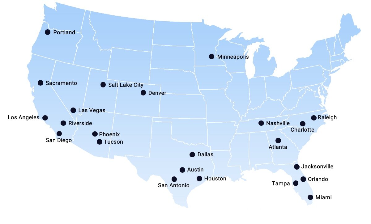
The strongest iBuyer markets are centered in the West, Southwest, and South -- basically everywhere except the Northeast and Midwest. These markets, with older housing stock and longer winters, are more difficult to crack.

Major iBuyer Markets

 
Screen Shot 2021-06-28 at 10.36.16 AM.png
 

But it's no secret the iBuyers (and other models) plan to enter the Northeast. Opendoor's investor presentation clearly laid out the playbook and plan of attack, which includes expansion into the Midwest and Northeast corridor.

Opendoor's Target Markets

 
Screen Shot 2021-06-28 at 10.35.52 AM.png
 

Based on a pair of recent job postings, it appears that Opendoor is starting in Washington D.C., Virginia, and Maryland -- a market that RedfinNow and "Power Buyer" Orchard also entered earlier this year.


In early 2021, RedfinNow was the first iBuyer to launch in Boston. Meanwhile, Offerpad is expanding through the Midwest, recently announcing a launch in Columbus. This sits alongside Zillow Offers' presence in Cincinnati, a market launched in 2020.

 
14f3eae7-9d66-0188-1539-e910c8ae05af.png
 

Strategic Implications

Traditional real estate agents located in the Northeast and Midwest have had years to watch and learn. Billion-dollar disruptors are coming, featuring new models like instant offers, cash offers, and buy before you sell programs.

The Northeast accounts for 17 percent of the U.S. population, and local realtors can be zero percent forgiven for ignoring the coming disruption. Change is happening (slowly) and smart agents are adapting to that change. No market is immune. What's your plan? (Hint: Compete Where You Can Win).

Compete Where You Can Win

In the fast moving world of real estate, it’s never been more important to define a crisp and effective strategy. A portion of my work consists of strategic consulting for a range of real estate tech businesses. That experience has taught me a lot, and I can sum up what I believe to be the single most important concept in strategy: Compete where you can win.

A three minute video of me talking about "Compete Where You Can Win."

Find Your Sustainable Competitive Advantage

All of my strategy work — from multi-billion dollar organizations to scrappy start-ups — starts with a somewhat cliche business school phrase: sustainable competitive advantage. This is what sets a company apart from others; the collection of unique attributes that allow an organization to outperform its competition.

In the world of real estate tech, Zillow has its massive consumer audience, Compass has its deep pockets, Keller Williams has its scale, and Realogy has its brands.

Clearly identifying a sustainable competitive advantage — a company’s strengths — is an important first step in an effective strategy. The critical second step is leveraging that competitive advantage directly against a competitor’s weakness or a market opportunity — competing where it can win.

Case Study: Compass

Perhaps the best case study is Compass. Its competitive advantage was capital ($1.5 billion in VC funding), which it used to gobble up market share.

The competitive weakness that Compass exploited was a traditional brokerage’s inability to compete on capital. Competitors couldn’t match Compass’ commission splits, signing bonuses, or marketing support. Unlike its competitors, Compass didn’t need to worry about being profitable, and the company leaned heavily into this strategy to recruit agents and grow its market share. Compass played a game that it, and it alone, could win.

Compete Where You Can Win

What truly sets yourself or your business apart from others? What can you offer that no one else can, and how can you leverage it against your competitor's weak points? It’s senseless to go up against your competitors where they are strongest (although many still try).

Anyone in real estate, from disruptor to incumbent, behemoth to startup, tech company to individual agent, can effectively compete in today's quickly changing market. It all comes down to being smart about understanding your strengths and competing where you can win.

Zillow, Power Buyers, and the Challenge of Attaching Mortgage

In 2018, Zillow set itself lofty goals when it entered the mortgage business. Three years later, Zillow's actual performance is far, far below its predictions, highlighting how difficult the mortgage space is, not just for Zillow, but for every real estate tech company targeting mortgage as a lever for growth.

Setting High Expectations

Zillow's 2018 Annual Report, released after Mr. Barton assumed the CEO role, clearly set out the company's 3–5 year goals in mortgage:

Mortgages Segment

  • Zillow Home Loans achieves a 33 percent attach rate to Zillow Offers, up from zero in 2018.

  • Zillow Home Loans originates more than 3,000 loans per month, up from nearly 4,000 MLOA loan originations in all of 2018.

The 33 percent attach rate to Zillow Offers is down from the lofty 75 percent attach rate quoted earlier by Mr. Rascoff in Zillow's 2018 second quarter earnings call:

"So for anybody who is wondering why we just bought a mortgage lender, just to hit some of those numbers again, at a mere 10,000 homes sold a month from Zillow Offers, a 75% attach rate gets to over $800 million a year of revenue opportunity for mortgage origination.”

Three years and over 10,000 homes bought and sold later, the reality is a mortgage attach rate to Zillow Offers of less than 1 percent.


(Zillow and Opendoor's attach rate is based on the markets where the service is live.)

Zillow's goal of originating 3,000 loans per month, or 36,000 in a year, remains highly aspirational. Loan originations actually took a step backwards in 2019 before rebounding in 2020 due to the pandemic and record low interest rates -- but are still less than 20 percent of Zillow's original goal.


It's worth noting that proportionally, Zillow's purchase volume (versus refinance) has steadily declined from 97 percent in 2018 to 31 percent in 2020 (and down to 10 percent in Q1 2021). The growth in Zillow Home Loans is being fueled by refi.

The Rise of Power Buyers

Ironically, Zillow is attaching more mortgages to Opendoor-owned homes than it is to Zillow-owned homes. Just let that sink in.

This bizarre fact underscores how difficult it is to attach mortgage to an iBuyer home for sale; most prospective buyers are already pre-approved. It's too late in the buyer journey to introduce and attach a new financing option.

Which is why the smart money is on companies -- I call them Power Buyers -- focused exclusively on attracting buyers earlier in the process with products like cash offer and buy before you sell. Examples include Homeward, Orchard, and Knock, and initiatives like Opendoor's Cash Offer and Zillow's video tease of it helping a Zillow Offers seller secure financing for their next purchase.

There are a multitude of companies attempting to sell mortgage and other adjacent services to their customers in an effort to increase profits. For the time being, the Power Buyers are in the lead with mortgage attach rates approaching 80%, with the iBuyers pivoting their models to catch up. Zillow's experience shows that it's a long, slow road, requiring big investment, patience, and a smart, consumer-first approach.

Compass Agents: You Are The Customer

As a newly public company, Compass faces a challenge to reach profitability. Its latest numbers reveal a noticeable drop in agent commission splits, a reminder that Compass’ path to profitability lies directly through -- and may come at the expense of -- its own agents.

Compass incurred losses of $212 million in its first quarter as a public company, compared to the $270 million it lost in all of 2020. Meanwhile, Compass’ peers managed to turn a profit during some of their best quarters ever.

 
Screen Shot 2021-05-17 at 12.12.46 PM.png
 

The $212 million loss includes a one-time expense of $149 million of stock based compensation. Looking at Adjusted EBITDA, where each company backs out various expenses to provide a more favorable accounting of the business, still reveals significant losses -- compared to the healthy profits at eXp and Realogy.

 
Screen Shot 2021-05-17 at 12.12.49 PM.png
 

The data reveals a brokerage continuing to lose money, especially compared to its peers, during a booming real estate market. But now that Compass is public, the spotlight is turning towards profitability and leading to an obvious source of additional profit: its agents.

The Agent is the Customer

In the first quarter of 2021, Compass’ agents generated $1.1 billion in revenue and were paid $900 million in commissions (including stock). But the effective agent commission split of 80.8 percent is a noticeable drop from the past year. While its brokerage peers paid proportionally more money to their agents, Compass paid less.


In its public filings, Compass attributes this “favorable decrease” (their words, not mine) to “the change in mix of the commission arrangements we have with our agents” and “changes in geographic mix.” The agent economics are changing in Compass' favor, and Compass is retaining more of the commission.

This dynamic is not unique to Compass, but it highlights the natural tension between brokerage and agent when less money being paid to agents is seen as “favorable” and “an improvement.”

For Compass, a reduction of its effective agent commission -- through a combination of changes in commission arrangements, geographic mix, and increasing technology fees -- of just 3 percent results in immediate profitability.

 
Screen Shot 2021-05-18 at 5.02.49 PM.png
 

It's highly unlikely that Compass will drop its agent commissions 3 percent and survive as a business. Agents would simply pack up and leave. But the gap isn't too far and, combined with rising technology fees, represents the fastest path to sustained profitability.

Compass' effective agent commission drop in Q1 2021 is the largest seen in two years. It may be an outlier or it may be the start of a trend, but it remains a key metric to watch going forward. And if you're a real estate agent, this is a gentle reminder to never forget that you are the customer.

A note on data: When calculating Compass' effective agent commission splits, I've included stock-based compensation. For Q1 2021, I've backed out the one-time acceleration of stock-based compensation expense of $41.7 million in connection with the IPO.

The Compass Valuation Quandary

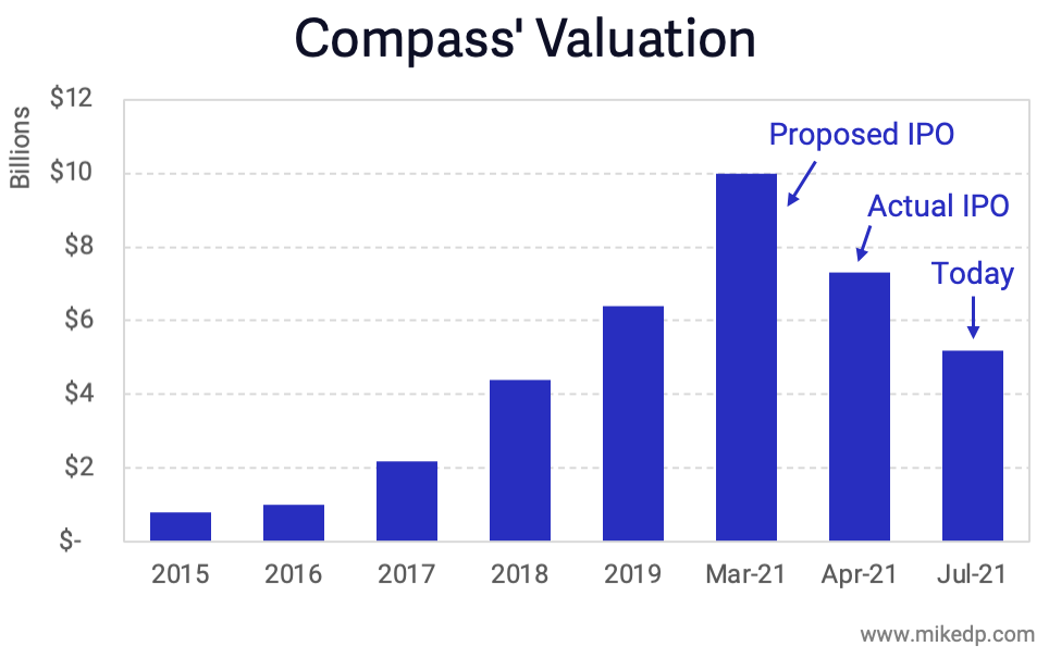
Compass' recent debut as a public company was a mixed bag. Of considerable note is the current valuation: $6.65 billion, compared to $6.4 billion when it last raised capital two years ago. The tiny gain brings up interesting questions: Why has Compass' valuation not increased more, and how does it compare to its peers?

 
Screen Shot 2021-04-08 at 7.43.57 PM.png
 

Compass has a massive valuation, on par with Redfin and dwarfing Realogy. This analysis isn't about the valuation itself, but rather changes in value over time. Often, trends and momentum reveal more than absolute figures.

Between July 2019 and April 2021, many real estate and real estate tech stocks have seen massive gains, even traditional incumbents like Realogy and RE/MAX. However, Compass stands out with a tiny 4 percent gain in valuation over the past two years -- two years which has seen massive growth at the company across all metrics.

Compass has positioned itself on the cutting edge of real estate tech, promising to revolutionize the industry through unprecedented investments in technology. However, the company valuation has hardly budged in two years. Why the disparity?

The valuation discrepancy -- especially compared to its peers -- stands out loud and clear. Investors either significantly over-valued the company in its previous fundraising rounds, or are pessimistic about its growth prospects going forward.

Research note: Company valuations from July 2019 are taken from GCA Advisors research, and for 2021 are from April 8th. All valuations are a like-for-like "equity value." Opendoor's 2019 valuation is from March, the remainder from July 2019.

America's Next Top Real Estate Model: Tracking the Growth of eXp, Redfin, and Compass

Compass, eXp Realty, and Redfin are three of the largest, fastest-growing brokerages in the U.S. Each operates a traditional brokerage business model and leverages technology as a key competitive differentiator. A deeper look at the rapid rise of each reveals a trio of insightful growth stories — which may very well shape the future of America’s real estate landscape.

 
ezgif-3-e37322da240f.gif
 

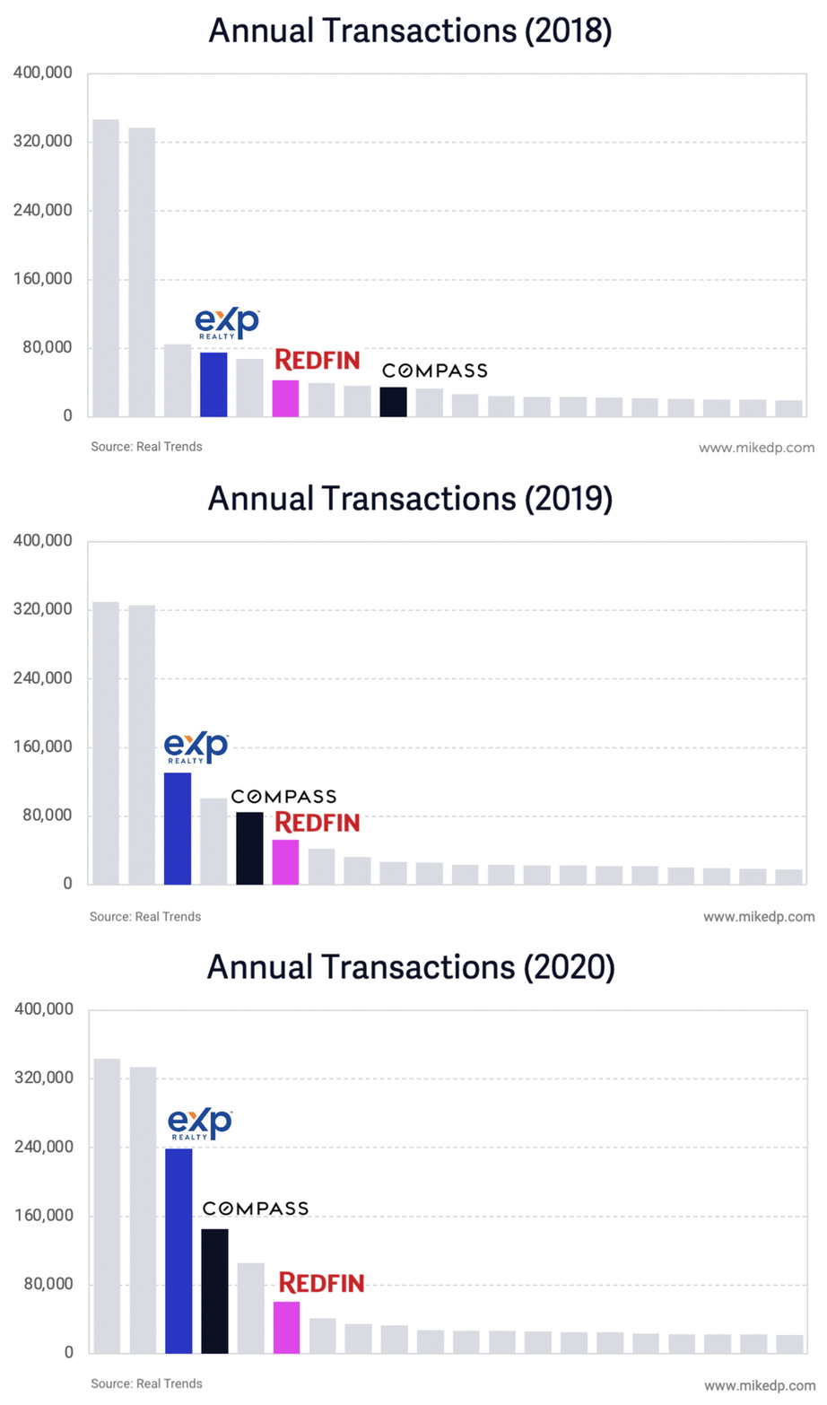
The changes to the top 20 U.S. brokerages by transaction count are striking (data courtesy the Real Trends 500). In 2018, the top two brokerages (Realogy and Berkshire Hathaway HomeServices) dwarf the competition; no other brokerage comes close. Fast forward to 2020, and eXp Realty is within striking distance of the top two, followed closely by Compass.

Each business has experienced wildly different growth trajectories. Compare Redfin’s slow and steady growth to the exponential hockey stick curves of Compass and, most impressively, eXp Realty.

 
Screen Shot 2021-04-06 at 8.11.09 PM.png
 

The engine room of each company’s growth is driven by agents (as I like to say, agents sell houses, not technology). The corresponding agent count at each company closely mirrors overall transaction count growth. Redfin has far, far fewer agents than its peers, but its agents are exponentially more efficient.

 
Screen Shot 2021-03-31 at 9.29.41 AM.png
 

Since 2018, Compass and eXp have grown agent count and transaction volume exponentially, which -- at this scale -- is unheard of, and why each company is so disruptive in the industry.

 
Screen Shot 2021-03-31 at 9.29.54 AM.png
 

Reviewing the interesting similarities and key differences between the three companies reveals their different target markets, represented by average sales price. Compass is clearly in the luxury band, while Redfin caters to high priced homes and eXp is closer to the national average home value.

 
Screen Shot 2021-03-31 at 10.04.39 AM.png
 

In the end, Compass and eXp are quite similar: fast-growing real estate brokerages fueled by unprecedented agent growth. Both companies leverage cash (or the promise of cash via stock options and/or multi-level marketing) to recruit, and lean on technology as a differentiator.

In 2018, it could have been possible to ignore the companies or dismiss their efforts to grow. But in 2021 they've become too big to ignore, and are cementing -- and growing -- their leadership position in the future of real estate.

 
Screen Shot 2021-03-31 at 5.42.19 PM.png
 

Beginning to Unpack the Compass IPO in Four Charts

At long last, Compass' IPO filings have revealed the financials and other key metrics of the business. This Friday I'll be hosting a paid webinar to fully unpack the filing, along with examining key strategic questions and implications for the business. To start, here's a few key takeaways presented around four charts.

Financials

Compass is unprofitable -- a net loss of $270 million in 2020 -- a result of its operating expenses exceeding its gross profit (revenue after paying out agent commissions). Losses were growing into 2019, and contracted in 2020.

 
72c3976d-e59d-459e-be56-863e3ae10f11.png
 

Historically there's been a wide gap between these figures, resulting in massive unprofitability. Last year was an outlier due to Covid-19; Compass saw a surge in revenue during Q3 and Q4, while its expense growth dropped significantly (partially driven by a reduction of headcount, operations & support, and sales & marketing).

Annual Growth and Efficiency

Between 2019 and 2020, Compass did 66 percent more transactions with 48 percent more agents (note: I'm using a midpoint total agent calculation, instead of the smaller Principal Agent figure provided by Compass). The result is an improvement in efficiency: on average, each agent did 12 percent more transactions.

 
6e40b6db-1daf-459d-a6da-f0d7b4237e58.png
 

Context: the market was crazy hot in 2020; many agents were doing more transactions. The market as a whole was up 5.6 percent for the year, and December alone was up 22 percent compared to last year. At the end of the day, 12 percent is an incremental improvement, and much of it could be driven by the hot market.

The real key is that the number of Compass employees was only up 29 percent. In other words, Compass was able to support 48 percent more agents and 66 percent more transactions with only 29 percent more employees. That's a promising sign of improving operational efficiency.

Improving Operational Efficiency

Another sign of improving operational efficiency is Compass' total Operations and Support expense ($225 million in 2020) relative to the number of agents and transactions the business supports. Over the past three years, it's gone down, a sign of improving efficiency.

 
5b27a16c-a49d-4c49-8d48-5a21d41a0bb1.png
 

Gross Margins

When all is said and done, the Compass financials are bleak if you care about profitability. One of the biggest challenges is Compass' gross margins -- which are total revenues minus agent commissions and other transaction-related expenses. It's the "net revenue" a business makes before all of its indirect expenses are taken into consideration.

 
a7c8c5f6-a996-4908-a9b8-a5610344d877.png
 

Compass' gross margins are low (and have been dropping over the past few years). Its gross margin is on-par with traditional brokerage peers in the industry -- and, interestingly, are the same as aircraft manufacturer Boeing. These are not the 70%+ gross margins of a technology company.

Compass is losing less money per transaction as it scales, but it's still losing a lot of money. The path to profitability, which I'll cover in my webinar, is uncertain. The fundamentals of the Compass business model, anchored by its low, brokerage-style gross margins, coupled with sky-high expenses, paint a particularly interesting challenge for the business -- and the industry -- going forward.

Real Estate Lessons From New Zealand's Latest Lockdown

The reemergence of Covid-19 in New Zealand, along with new lockdowns, provides further examples of its effect on the property market. As a case study for markets around the world, the results highlight less severe outcomes the second time around.

Another Drop in New Listings

New Zealand's recent lockdowns, which began on August 12th, affected the country in a similar, but less dramatic, fashion than the strict lockdowns earlier in the year. The level 4 April lockdowns were a total shutdown, which saw new listing volumes drop 85 percent. The most recent level 2 & 3 lockdowns are less severe, with a much smaller drop in new listings.


Both lockdowns saw a return to the same behaviour: a drop in new listing volumes. But the effects are wildly different, and tightly correlated to the severity of lockdown.

The monthly change in new listing volumes was most pronounced in Auckland, which was under a strict level 3 lockdown. At level 2, the rest of the country was fundamentally unaffected.

 
image.png
 

The national drop in new listing volumes was driven by the country's largest market, Auckland. However, looking at only Auckland reveals a less severe impact than one might expect. The drop in new listings is noticeable, but marginal, and new listings are still higher than the same time last year.


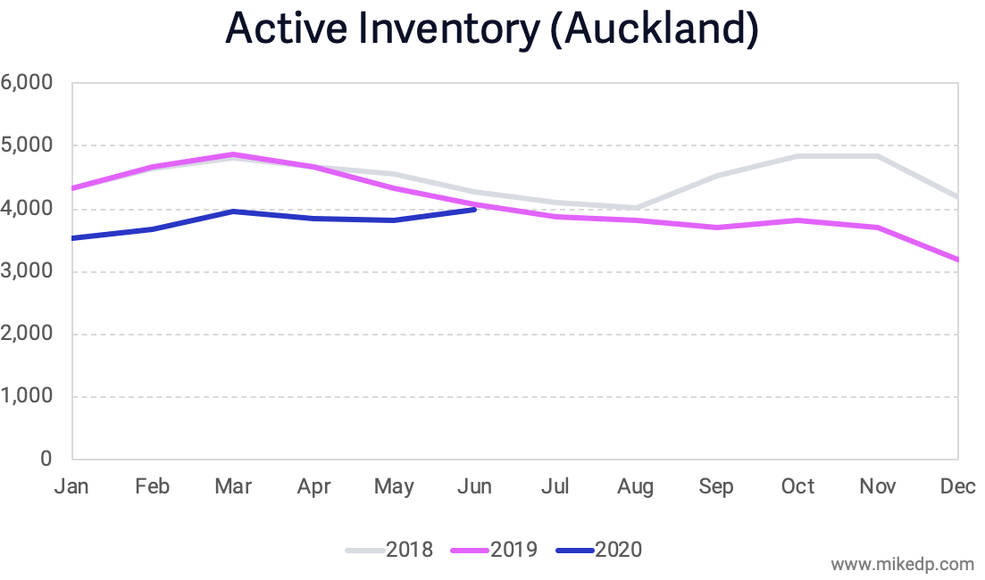
With buyer demand remaining strong, the natural result is a drop in inventory. But similar to new listings, it is not as severe as one might expect: A small decline, rather than plummeting inventory levels.

 
image.png
 

Inventory is certainly constrained, but it's not quite the property armageddon that is sometimes portrayed in the media.

Strategic Takeaways for International Markets

New Zealand's Covid rollercoaster highlights several lessons that can be applied to markets around the world:

  • Subsequent lockdowns appear to have less of an effect on consumer confidence in bringing a home to market. There is less overall impact on new listing volumes.

  • The more severe the lockdown, the larger the drop in new listing volumes. However, the severity is not linear; the strictest lockdowns have an exponentially greater impact on the market (Auckland's level 4 lockdown saw a monthly decline in new listings of 46 percent, compared to a monthly decline of 7 percent during the August level 3 lockdown).

  • If authorities can implement lockdowns in a targeted, focused way, the effect on the real estate market is significantly lessened. 

As the pandemic continues around the world, the evidence from New Zealand suggests that the worst for the property market may be over (at least in terms of new listings and inventory). Subsequent lockdowns appear to have less of an effect, with a targeted approach yielding the best results.

A Study of Market Recovery in the U.S., Sweden, and New Zealand

New listing volumes are an important lead indicator for the real estate market. The U.S., Sweden, and New Zealand offer three contrasting case studies of pandemic response and real estate market recovery.

Varying Drops in New Listing Volumes

The U.S. real estate market experienced a steep decline in new listings coming to market during lockdown in April and May. The recovery has been slow and gradual (a checkmark), with levels still down from last year. The pent-up supply from lockdown hasn't hit the market; there's a huge hole in available inventory.


In New Zealand, there was a hard and fast lockdown that resulted in an immediate and sharp drop in new listing volumes. However, once lockdown was lifted and Covid-19 was eliminated, the market quickly bounced back to normal. Unlike the U.S., new listing volumes surged to higher than normal levels -- a natural result of pent-up supply from the lockdown coming to market.

 
image.png
 

Sweden never really went into lockdown, with much of the country carrying on as normal. The real estate market followed suit, with new listing volumes only dipping slightly in April and May compared to the same time last year. There is no real market recovery because the market never dropped away like in the U.S. and New Zealand (the summertime drop is seasonal).


Summary of Evidence

All three countries are at different points on the spectrum of pandemic response and real estate market recovery.


Key observations:

  • With the strictest lockdown, New Zealand experienced the largest drop in new listing volumes (65%), but recovered quickly with new listing volumes up 20%.

  • With a moderate lockdown, the U.S. experienced a moderate drop in a new listing volumes (40%), but recovery is taking longer, with new listing volumes still down 5% compared to last year.

  • With no lockdown, Sweden never experienced a drop in new listing volumes. The market continues to operate normally.

The data suggests that the harder the lockdown, the bigger the drop in new listing volumes -- and the faster the recovery. 

Many thanks to Redfin, Hemnet, and realestate.co.nz for the market-specific data.

New Zealand's V-Shaped Real Estate Recovery

With zero cases of Covid-19 in the community, New Zealand is one of the very few countries where life has returned to normal. After two months of lockdown, the country's property market is demonstrating healthy market dynamics on its road to a true V-shaped recovery -- and serves as an interesting comparison to the U.S.

New Listings Supply

New listing volumes at Barfoot & Thompson, Auckland's largest real estate agency with over 40 percent market share, rebounded quickly after the country emerged from lockdown. New listing volumes in June were higher than normal -- an expected effect of pent up supply from the lockdown.

 
08552899-6bbe-4d83-bc75-78309277d340.png
 

At a national level, new listing volumes (as tracked from a major real estate portal) show a similar trend: an extreme dip during lockdown, followed by a healthy rebound.


Compare this to the U.S., where new listing volumes (as tracked nationally by Redfin) are still depressed and below last year's numbers.


New listings -- supply -- are the lifeblood of a healthy property market. A lack of inventory can create liquidity problems in a market recovery.

Buyer Demand

Critically, buyer demand has closely matched seller demand in New Zealand. The number of sales in Auckland has rebounded quickly and strongly, reaching levels higher than last year in June.

 
71266fc0-e85e-494f-960d-f307b479c79a.png
 

Comparatively, home sales in the U.S. are still recovering and below last year's levels. But the overall trend is the same: a temporary dip followed by a recovery. New Zealand appears to have recovered fully, while the U.S. is still catching up.


Inventory

A strong measure of a healthy market is inventory -- the number of active listings in a market -- and which direction it is trending. In some U.S. markets, buyer demand is outstripping new listings coming to market, creating a precipitous drop in inventory.

 
c758e122-81c4-4ae2-849b-cb769230f883.png
 

At a national level, inventory levels in the U.S. continue to drop in a season when they normally grow. Buyers are picking up houses faster than sellers are bringing new homes to market.


The story is different in New Zealand. Inventory levels in Auckland have remained relatively constant through lockdown, and -- most importantly -- have not dropped as buyers and sellers come back to the market. In other words, buyer demand is being matched by seller demand.


The evidence suggests that New Zealand's housing market is experiencing a true V-shaped recovery. Buyers and sellers are back on the market at levels similar to or exceeding last year (driven by pent up demand).

In New Zealand, life returned to normal fairly quickly, and the housing market appears to have followed suit. As the U.S. continues to wrestle with waves of the pandemic and increasing uncertainty about the future, the housing market is reacting with greater extremes. There is a frenzy of buyer activity, while new listing volumes continue to lag historical levels -- all leading to an unprecedented drop in inventory.

Inventory Levels Down 20–40% Across U.S. Markets

There's a reason I've been talking about new listing volumes as the best lead indicator of the health of the real estate market. That reason is now clearly manifesting: a precipitous decline in available inventory across the U.S. Less new listings leads to less inventory, which is causing a supply vs. demand imbalance.

National New Listings and Active Inventory

Nationally, new listings dropped significantly -- down 40+ percent -- and are slowly recovering. The velocity of that recovery has slowed in recent weeks; new listings are coming to market slower, and are still down 18 percent compared to last year.


The significance is that when new listings stop coming to market, overall supply -- inventory -- drops. There are less available homes for prospective buyers to purchase. Nationally, the number of active listings is down 25% as of June 21st. And the slope of the line is heading down, both absolutely and compared to last year.


Active Listing Tracker

It's with this issue in mind that I'm happy to announce the addition of an Active Listings chart to my Real Estate Market Tracker. As with the other charts, it's interactive, so plug in whatever markets you want to compare.

An overview of some of the biggest markets in the U.S. shows, with few exceptions, that the number of active listings in most markets is down 20–40 percent compared to last year. Demand is strong, and buyers are gobbling up the available inventory.


Markets like Atlanta, Dallas, Seattle, Chicago, Phoenix, and others show a strinkingly common downward trend. Compared to last year, the number of active listings is plummeting downward. 

 
image.png
 

The Significance of Inventory

A drop in active listings isn't necessarily a problem, but it's a significant disruption to the market dynamics of supply and demand. If the amount of active buyers remains constant, and the available inventory drops, house prices will rise.

In many markets -- and nationally -- the available inventory continues to drop, and doesn't appear to have stabilized yet. The supply vs. demand imbalance, especially in certain markets, is acute. And with the recovery of new listings coming to market slowing, and buyer demand remaining strong, it does not appear to be changing anytime soon.

Observations on the U.S. Market Recovery

The U.S. real estate market is in the midst of a recovery. Important lead indicators are up from their lows of the past several months, and nearly every graph is moving up and to the right. But a high-level snapshot does not paint an accurate picture; a deeper look reveals the varied nature of the recovery rollercoaster.

A National Look

Redfin does an excellent job of presenting an up-to-date and accurate picture of the U.S. market. Starting at the top of the funnel -- new listings -- the recovery is clearly visible. New listings coming to market are swiftly rising, and are currently down only 18 percent compared to the same time last year (and yes, it looks like a checkmark).

 
ab0d2366-1a6e-48d6-bfc4-06e2a1fa6608.png
 

Pending home sales took a big hit in April and May, but are recovering just as quickly as new listings, a sign of strong buyer demand (likely driven by low mortgage rates). Pending sales are nearly at the same level they were last year.

 
4b54ec5f-c5d1-400d-ae5e-ee3d298ea125.png
 

Home sales lag all other indicators -- it can take one to three months between a new listing coming to market and a home being sold. Transaction volumes will recover, but it may take many months.

 
1f955109-4b90-43e8-80f2-c1c3796de43c.png
 

National data paints a straightforward, if over-simplistic, picture of a real estate market in recovery. A market-by-market analysis shows the varied nature of recovery.

Market-Specific Analysis

There are many different markets in the U.S., and each is recovering differently. Utilizing my Real Estate Market Tracker (which is an interactive tool; give it a spin), it's clear that all markets are seeing an uptick in pending sales, but at different rates.

 
8e3a79f1-167e-4fbd-a0cd-5221e5ad7f57.png
 

Looking at the data on a year over year basis reveals an interesting trend: Half the markets surveyed are up compared to last year, while half are down significantly.

 
cb2722c9-ca14-465f-b7c7-d70136ded5ca.png
 

For example: Pending home sales in Austin and Tampa are up 30–40 percent after a quick recovery, reflecting very strong buyer demand. In the major coastal cities like L.A. and NYC, pending sales are still down 30–60 percent compared to last year.

 
59d0ed52-8eb6-4dda-9afd-211da6dd4461.png
 

The picture of recovery in King County, Washington (Seattle) is common in many markets: Gradual. New listings coming to market, which were down 50 percent in March, have slowly increased over the span of three months, and are still not at historical levels.

 
6651f3cc-7121-430b-bc1f-88f954181a80.png
 

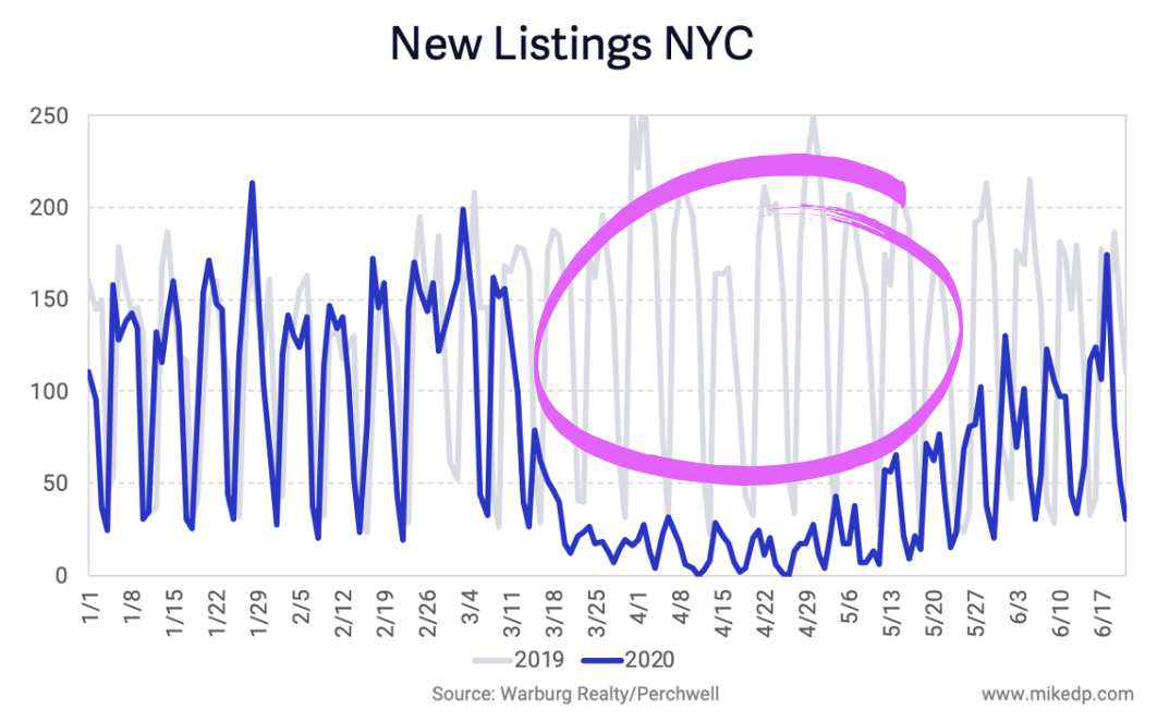
New York City saw the most severe drop in new listings -- down 85 percent -- and is finally seeing an uptick (call it a surge?) in new listing volumes after three months of real estate lockdown.

 
cb77b813-e940-4eb4-82f8-982e78832bb0.png
 

But the big question for NYC is: What happens to the missing three months of new listings? It's a massive volume. Will they come to market now, over the next few months, or will it remain a giant hole in 2020 transaction volumes?

The Key Takeaway

Looking at only the national numbers paints an over-simplified version of the U.S. market recovery. It looks like a smooth, predictable rollercoaster that has gone down and is steadily heading back up. In reality, there are ten thousand different rollercoasters moving independently of each other, all at different speeds and at different points on different tracks. Not all markets will recover the same.


If you enjoy data as much as I do, give the Real Estate Market Tracker a spin. Compare any number of markets in the U.S. I also highly recommend visiting Redfin's Data Center and Zillow’s Weekly Market Report for national and market-specific data.

The Pandemic’s Varied Effect on International Real Estate Markets

The pandemic affected international real estate markets in strikingly different ways. Markets with stringent lockdowns saw new listings plummet by 90 percent, while other markets saw no change. And as the world begins to recover, the data suggests that the longer and more severe the lockdown, the faster the initial recovery.

New Listings

The number of new listings coming to market is a key indicator of a healthy real estate marketplace, representing high-intent seller demand and available inventory. The decline in new listing volumes across seven countries has varied wildly, from no change to a 90 percent drop, depending on the market and its associated lockdown.

Screen Shot 2020-05-20 at 7.13.23 AM.png

Unsurprisingly, the drop in new listing volumes is tightly correlated to the severity of lockdown imposed by national and local governments. Of the nations analyzed, Italy and the U.K. had the most stringent lockdowns, with many real estate activities deemed non-essential and severely limited. The drop in new listings was greatest in these markets: between 75-90 percent.

The Australian, U.S., and Canadian real estate markets were less restrictive, and the drop in new listings reflects that: 40-50 percent at a national level. In the U.S., that number varies greatly by state, with some markets (Pennsylvania, Michigan, and New York) mirroring the severe drop of up to 90 percent seen in the U.K. and Italy.

Most surprisingly, some markets were barely affected. The Netherlands and Sweden imposed “intelligent lockdowns” far less restrictive than many other countries. As a result, The Netherlands in particular hasn’t seen a significant drop in new listings; rather, it’s enjoying annual highs. Interestingly, new listing volumes in Sweden have seen a limited, delayed decline -- about a month after most other markets -- of 20 percent.

Portal Traffic

Web site and mobile traffic to real estate portals suffered an expected drop, but quickly recovered in most of the markets analyzed. 

Screen Shot 2020-05-20 at 7.13.24 AM.png

Once again, markets with “intelligent lockdowns” -- The Netherlands and Sweden -- saw less of a drop and are currently experiencing annual highs. Australia and the U.S. quickly recovered and are up from last year, while the U.K. lagged behind due to its stringent lockdown (why browse when the market is closed).

A less restrictive lockdown doesn’t directly affect someone’s browsing behavior. But the closer to “normal” a lockdown is, the more consumers will continue their normal portal browsing behavior.

A Fast Recovery

Based on the evidence from the U.K. and Italy, it appears that the longer and more severe the lockdown, the faster the recovery. Both countries have seen a surge in new listing volumes after restrictions were lifted, a signal of strong pent-up demand. The following chart shows the rise in new listings after the U.K. reopened the housing market on May 13th.

Screen Shot 2020-05-19 at 2.04.47 PM.png

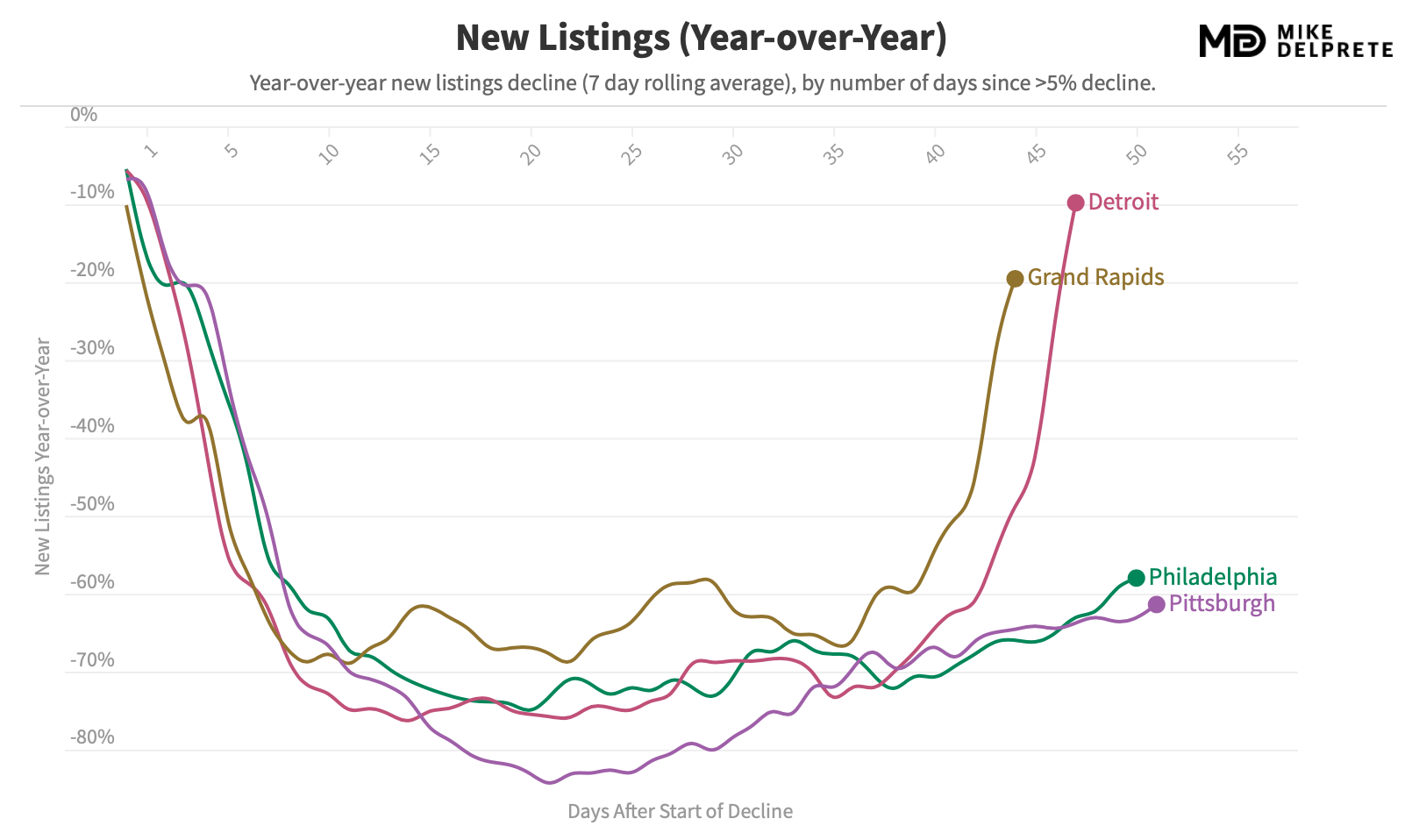
That market behavior is similar to two of the hardest hit U.S. markets -- Pennsylvania and Michigan -- which prohibited most real estate activity and saw new listings drop 70-80 percent. After easing restrictions, Michigan’s Detroit and Grand Rapids saw an immediate surge in new listings come to market -- similar to Italy and the U.K. 

Screen Shot 2020-05-18 at 5.20.41 PM.png

The evidence suggests that once restrictions are lifted in the hardest hit markets, new listings rebound quickly. However, new listings are only one component of a full market recovery. Buyer demand, leading to completed real estate transactions, will come over time -- and it’s unclear how long that recovery will take.

A Note on Data Sources

This analysis uses previously unpublished data from a number of international real estate portals and organizations: 

  • Hemnet (Sweden’s top real estate portal)

  • Funda (The Netherlands’ top real estate portal)

  • REA Group (Australia’s top real estate portal)

  • Zoopla (U.K.’s #2 real estate portal)

  • Fourwalls and rennie (Canada)

  • A top Italian real estate portal (Thanks!)

  • Redfin’s Data Center (U.S. new listing volumes)

  • Zillow’s quarterly shareholder letter (U.S. traffic volumes)

Thank you to the leading real estate portals and other organizations around the world that collaborated with me to produce this first-of-its-kind international analysis. How does your market compare? Let me know!

An Analysis Of Pending Sales, A Proxy For Buyer Demand

Much of my market research has focused on new listings coming to market, a strong proxy and indicator of seller demand. Now I've turned to pending sales -- offers being made and accepted on a home -- as an equally strong proxy for buyer demand.

As expected, the number of pending sales is beginning to rebound in some markets as restrictions ease.

Pending sales -- representing increased buyer demand -- are increasing in a number of cities like Tampa, Chicago, and Seattle. Following a significant dip around the end of March, the number of pending sales has steadily increased throughout April, in the all-too-familiar checkmark shape.

However, not all markets are recovering. Several major East and West Coast metros, including New York City, Philadelphia, San Francisco, and Los Angeles, are still in their lows and have yet to see the number of pending sales recover.

8728631d-6c68-4e0d-bb96-d18352bbf795.png

Comparison to Last Year

The analysis above simply looks at the number of pending sales over time. Given the seasonal nature of real estate, a second, important dimension to consider is year-over-year performance: How does 2020 compare to 2019?

An annual comparison shows many markets down between 20-80 percent compared to the same time last year, with some recovering, and others still flat.
 

Some markets, like Austin, have recovered quickly with pending sales at the same level of last year -- highlighting strong buyer demand. While it is recovering, Seattle is still down a significant 20 percent from last year, with New York and San Francisco still down 60-80 percent from 2019 volumes.

3cfeec06-cf15-41c4-a6dd-f498dbbb8fb2.png

The advantage of plotting data over time is the ability to reveal momentum. Markets like Nashville, Raleigh, and Charlotte are all trending lower; buyer demand is not picking up as quickly as last year. Not all markets are in recovery mode.

Key Takeaways

The data suggests that buyer demand (as represented by pending sales) has been significantly effected by the pandemic. Volumes are down over 35 percent nationally, with some markets down as much as 60-80 percent compared to last year. Buyer demand is beginning to recover in some markets, but not all.

Try it Yourself

I was recently quoted in an article on Curbed: "No matter what narrative you have you can support that story with data. You can find data to support any story you want, whether it’s everything is fine, it’s the end of the world, or something in between.”

My goal with this analysis is to replace uncertainty with data, and to give you the tools to explore the data directly: try it out with my Real Estate Market Tracker.

(It's worth noting that while the data comes from Redfin, it's not perfect. Several markets, including Atlanta, Dallas, and San Antonio were removed from this analysis because of significant data issues. I hope to include them in the future.)

Research Study: Measuring Compass’ Agent Productivity

It’s not easy to measure agent productivity. There’s no magic number to compare one agent against another, nor measure one brokerage against another. True agent productivity -- selling more houses, for more money, faster than the competition -- is multi-dimensional and nuanced, influenced by technology, the market, and brokerage operating models.

Compass has invested tens of millions of dollars into technology over the years and has claimed its agents are more productive than its peers, in no small part to its technology platform. “One of Compass’ competitive advantages is that every employee has a singular focus on agent productivity,” its CEO told Barron’s in 2018, while later claiming agents saw a 25 percent boost in transactions in their first year.

Using four methods of analysis, this research study aims to provide a deeper look at Compass’ agent productivity compared to its industry peers.

Research note: This analysis utilizes data from the REAL Trends 500, which ranks the largest real estate brokerage firms in the U.S. by sales volume and transaction count, in addition to my own independent research. To be fair to Compass and account for its massive growth during 2019 (8,000 to 15,000 agents), this analysis uses a midpoint agent count (11,500) for all 2019 calculations.

Defining Productivity

Agent productivity is a function of two inputs -- the number of transactions closed and the average home price -- which produces an agent’s sales volume (the total value of homes sold in a year).

 
Screen Shot 2020-04-22 at 3.16.28 PM.png
 

Average home price is a variable that’s difficult to change, and is highly dependent on the market. The number of transactions per agent is a result of many factors; one would expect efficiency gains made through technology to show up here. To measure productivity, we must look not only at sales volume, but the number of transactions an agent closes.

Method #1: Production

The most commonly accepted method of evaluating -- and comparing -- the relative productivity of real estate agents is sales volume: the total value of homes sold during a period of time. This metric, called production, translates directly to income, paid as commissions. The more revenue an agent generates, the more productive they are.

The following chart looks at the 20 largest U.S. brokerages by total sales volume during 2019, ranked in order of average sales volume per agent. On a per agent basis, Compass ranks near the top for average agent production.

 
Screen Shot 2020-04-22 at 11.01.35 AM.png
 

Evaluating agent productivity based on sales volume provides a broad basis for comparison, but misses several nuances. As outlined above, total sales volume is heavily influenced by the type of market an agent operates in. Agents operating in a luxury market can sell fewer houses and achieve a high sales volume.

Sales volume per agent is a great metric to track how much revenue an agent generates -- and arguably what a brokerage cares about most -- but it doesn’t fully capture the efficiency nor productivity of an agent. Those factors, which can be enhanced by technology or a unique operating model, requires deeper analysis.

Method #2: Transactions

The number of transactions an agent closes in a year is another measure of agent productivity. One could argue that a more efficient agent -- supported by technology -- would be able to close more deals, faster.

The following chart looks at the 20 largest U.S. brokerages based on total transaction count, ranked by the average number of transactions closed per agent. Redfin, with a unique operating model employing salaried agents, is the clear outlier. Compass is in the middle of the pack with an average of 7.4 transactions closed per agent in 2019.

 
Screen Shot 2020-04-20 at 2.55.42 PM.png
 

Benchmarking Compass against the average number of transactions closed per agent at the 20 largest brokerages, the 20 largest brokerages excluding Redfin, the four largest brokerages, and the two largest brokerages, shows Compass agents slightly below average.

 
Screen Shot 2020-04-28 at 4.26.06 PM.png
 

Simply looking at transaction counts fails to account for the relative price points of homes in different markets. While an agent in a high-end market may close less transactions, it may be a result of higher priced homes that take longer to sell, rather than overall efficiency.

Plotting both the average number of transactions and the average sales volume per agent again reveals Redfin as the outlier, while Compass is clustered with its high-end peers.

 
Screen Shot 2020-04-20 at 3.00.42 PM.png
 

Compass agents clearly produce a high sales volume, but overall efficiency as measured by transactions per agent reveals Compass agents to be slightly lower than the industry average.

Method #3: High-End Peers

The average sales volume per agent is heavily influenced by average home prices. High-end agents, doing fewer transactions each year, have a disproportionately higher sales volume due to high home prices. This makes it difficult to compare productivity at a high-end brokerage like Compass, with an average home price of $1.1 million, to a mid-market brokerage like Howard Hanna, with an average home price of $225,000.

One method to solve for this is to “freeze” the average home price in our equation, by only comparing Compass to its high-end peers. The following brokerages have average home prices similar to Compass, +/- $200k in value.

 
Screen Shot 2020-04-29 at 7.37.41 AM.png
 

The average sales volume per agent at these five brokerages shows Compass in the middle of the pack in terms of agent productivity. On average, Compass agents are neither more nor less productive than their up-market peers.

 
Screen Shot 2020-04-22 at 11.07.53 AM.png
 

Looking at the other measure of efficiency, the average number of transactions per agent, similarly reveals Compass to be in the middle of the pack. On a per transaction basis, compared to its high-end peers, Compass agents are on average...average; neither higher- nor lower-performing.

 
Screen%2BShot%2B2020-04-22%2Bat%2B11.07.56%2BAM.jpg
 

Method #4: Itself

Ultimately, perhaps the best peer comparison for Compass is itself. If “every employee has a singular focus on agent productivity,” one would assume improvements being made over time.

Between 2018 and 2019, the average sales volume per agent (using the same midpoint agent count calculations for each year) at Compass declined, from $9.1 million to $7.9 million.

 
Screen Shot 2020-04-22 at 11.14.18 AM.png
 

Was Compass alone with dropping sales volumes per agent? The evidence suggests it (almost) was, with three out of its four high-end peers increasing their average sales volumes per agent during the same period.

 
Screen Shot 2020-04-22 at 11.08.35 AM.png
 

Summary of Evidence

It’s undeniable that Compass agents have a high average sales volume; more than twice that of industry behemoths Realogy and HomeServices of America. But it begs the $6.4 billion dollar question: is it because of the agent, or because of Compass.

There’s no easy answer when the question is agent productivity. The evidence above -- coming from four different angles, and using all available information -- suggests the following:

  • Compared to the industry average, Compass agents generate a high sales volume.

  • The high sales volume is driven by high home prices, rather than agent efficiency.

  • Agent efficiency and productivity improvements, as a result of a sizable technology investment, have yet to materially manifest themselves.

Timing is a final, important consideration. As I outlined in an earlier analysis, The Three Eras of Compass, it was not until 2019 that the company’s technology investment truly matched its rhetoric. Unrivaled technology investment to boost agent efficiency has been a key component of the Compass narrative and an important recruiting tool, but — through the end of 2019 — remains an aspiration rather than a clearly demonstrable reality.

U.S. Markets Suggest Checkmark-Shaped Real Estate Recovery

Past analysis has shown that the Covid-19 pandemic and associated lockdowns will cause a significant dip in real estate activity. The latest U.S market data shines a light on what the dip and recovery will look like -- a checkmark shape -- with an immediate drop, 3-4 weeks at the bottom, and a slow recovery period.

 
Screen Shot 2020-04-21 at 11.15.11 AM.png
 

Recovery in the Front Line Markets

The effects of the dip are clearest in early-hit markets like Seattle in King County. It took approximately one week to hit the bottom, with another two weeks at the bottom before a rebound began. As expected, new listings are down 50 percent for the month compared to 2019, with a slow, 20 percent recovery each week.

 
Screen Shot 2020-04-21 at 10.28.59 AM.png
 

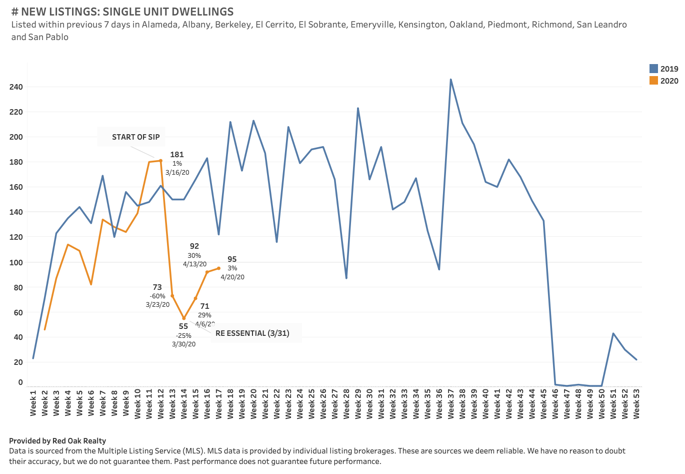
It is a similar story in California’s East Bay market. Once shelter in place orders were issued, it took only one week to hit the bottom. The dip lasted 2-3 weeks before a rebound in activity began. Like Seattle, the recovery is slow and gradual, with new listing volumes still down 50 percent from the previous year.

 
Screen Shot 2020-04-21 at 9.21.57 AM.png
 

Dropping Activity in Secondary Markets

Markets like Austin and Portland experienced a different dip in activity. These cities were not on the “front lines” of the pandemic outbreak, and shelter in place orders followed behind the first hit metros like NYC, San Francisco, and Seattle.

Austin wasn’t hit with an extreme weekly decline of new listings, like Seattle and the Bay Area, but experienced the absence of an expected seasonal increase in activity. The result is 31 percent fewer new listings over the past four weeks compared to the same period last year. The nature of the dip is different from other markets, but the timing is similar: a week to get to the bottom, and 3-4 weeks at the bottom (so far).

 
Screen Shot 2020-04-21 at 9.02.27 AM.png
 

Activity in Portland is similar. There is a noticeable weekly decline in new listings, coupled with a lack of seasonal growth. As with the other markets, it took about a week to get to the bottom of the dip, with 3-4 weeks at the bottom. New listings over the past four weeks are down 38 percent from the same period last year.

 
Screen Shot 2020-04-21 at 9.02.03 AM.png
 

The New York City real estate market (specifically Manhattan, Queens, and Brooklyn) was especially hard hit. While the dip to the bottom occured in about a week, activity has remained bottomed-out for five weeks and counting, with no recovery in activity.

 
Screen Shot 2020-04-21 at 9.01.03 AM.png
 

A Checkmark-Shaped Recovery

The dip occurs quickly. It only takes one week, maybe two, to hit the bottom of the curve in new listing volumes. The good news is that if you’re in a market that has seen a drop in new listing volumes, the first few weeks are as bad as it should get.

The stay on the bottom of the curve isn’t long. Most markets begin to see a recovery after 3-4 weeks. The exception occurs in markets like New York City that have more restrictive shelter in place orders.

Given the staggered timing of the pandemic, some cities are ahead of others in their recovery. This gives us a glimpse of what is likely to come. Please remember: Not all markets are equal, and the severity of the drop will vary wildly between them.

 
Screen Shot 2020-04-21 at 11.15.37 AM.png
 

The recovery is not immediate; it is a slow, incremental recovery of 20-30 percent each week. It is too early to know for sure, but recovery to 2019 levels could take anywhere from 8-16 weeks. Markets in recovery mode are still down 30-50 percent from 2019 levels.

 
Screen+Shot+2020-04-21+at+10.36.31+AM.jpg
 

Rather than a V- or U-shaped recovery, the current evidence supports more of a checkmark-shape. It begins with a severe, immediate drop, lasts 3-4 weeks, and is followed by a gradual recovery.